 TALLYA
The hour · 7 min
Why adults color
The coloring aisle makes claims it cannot support. What an hour of colouring reliably is — a bounded task, no screen, a…
Cottagecore borrows the objects of rural labour and draws them as rest. Where the look came from, why every generation reinvents it, and what makes a page cottagecore.
Cottagecore is usually described and rarely examined. Here is what it actually is, where it came from, and why the same idea keeps returning about once a generation.
Smallness. Not a farm — a cottage. Not a field — a kitchen garden. The scale is deliberately one that a single person could hold.
Domestic craft. Bread, preserves, mending, candles, bees, dyeing, keeping. Objects that show a hand was involved.
Self-sufficiency, gently. Enough to be independent, never enough to be commercial. Nobody in a cottagecore image is selling anything.
Slowness with visible edges. A loaf rises and is done. A jar seals or it does not. Every task pictured has an end you can see.
Almost every object in the cottagecore vocabulary is a labour object, drawn as rest.
The churn, the loom, the beehive, the hearth, the water pump — these were not hobbies. They were the unavoidable and physically punishing work of running a household without machines, largely done by women, and largely without a choice about it. Cottagecore takes that inventory and removes the compulsion.
That is not a scandal and it does not need defending, but it is worth saying out loud, because the version that pretends otherwise gets embarrassing fast. Cottagecore is not a claim about the past. It is a fantasy about scale, and the past is where the props are kept.
This is the detail that makes the whole thing more interesting: cottagecore is not new, and its predecessors are dated with unnerving precision to industrial pressure.
1783 — the Hameau de la Reine. Marie Antoinette had a working model hamlet built at Versailles: a dairy, a mill, a farmhouse, real animals. It is the ancestor of every cottagecore mood board and it was, transparently, an aristocrat playing at rural life. The comparison is unflattering and it is also fair.
The 1880s — Arts and Crafts. William Morris and the reaction against factory production: handmade over machined, honest materials, visible craft. The politics were serious and the aesthetic outcome was expensive hand-made goods for people who could afford them.
The 1890s and the 1970s — back to the land. Both arrived after periods of intense urbanisation, and both produced a literature about smallholdings, baking and self-sufficiency that reads almost identically to a modern cottagecore feed.
2018 to 2020 — cottagecore. The word appeared on Tumblr around 2018 and went mainstream in the spring of 2020, when a great many people were shut in small flats and thinking about bread. The timing is not subtle.
The pattern is consistent: the fantasy arrives whenever work becomes abstract. What is being missed is not the countryside — it is finishable tasks.
Once you see it as a fantasy about scale rather than about history, the appeal of a printed page becomes a version of the same thing.
A page has edges. You can see the whole job at the start and how much is left at any point. It ends, and something exists afterwards that did not exist before. That is exactly the shape cottagecore is nostalgic for, available on a Tuesday evening for the price of paper. Why adults color sets that argument out properly, including what cannot honestly be claimed for it.
So a cottagecore coloring page is not an odd pairing. It is the same want, delivered directly instead of pictured.
A dwelling, not a landscape. There has to be somewhere to be. A meadow is pretty; a meadow with a door in the hillside is cottagecore. See the mushroom door, the acorn house.
Evidence of hands. Something mended, planted, stacked, hung to dry. Untouched nature is a different genre. See the teapot garden, the bee skep.
A task in progress, not finished. Steam still rising, a door left ajar, a path half laid. Finished is a postcard; in progress means someone is coming back. See the first gentle steam, the door left ajar.
One light. The single lit window at dusk is the central cottagecore image, and it works because you are outside it. See the one lit window, indoors while it snows.
And — deliberately — no people. Our forty dwellings are figure-free, which was a decision rather than an omission. A figure in the picture tells you who is meant to live there, and the whole point of a cottagecore image is that the answer is you.
For the indoor, quieter end of the same feeling, The Hawthorn Hour works the domestic side directly: the candle and kettle ritual, the reading nook, the slow morning.
Warm and low-contrast, which is the opposite of most advice on this site. Cottagecore does not want a dramatic focal point — it wants everything to feel equally inhabited.
Three warm neutrals plus one green. Cream, ochre, terracotta and a soft sage will carry an entire page. Cottagecore goes wrong through saturation, not through a wrong hue: bright primaries turn a cottage into a children's illustration instantly.
Keep the lit window as the only high-contrast element. If there is a light in the picture, that is where the value range should be widest and nowhere else.
Leave plenty of paper. Bare white reads as morning, mist and air, and this is a genre that needs room to breathe.
Technique for building warmth in layers is in coloring techniques; getting the page onto paper without cropping is in how to print coloring pages.
Every page in the library is a narrative mandala: radial architecture, nameable objects, arranged so that reading from the rim inward follows an order. On a cottagecore page that structure does something specific — the rim is the weather and the world outside, the middle band is the boundary of the dwelling, and the centre is the warm interior you are not currently in.
That is why the single lit window works at all, and it is why these pages are composed rather than assembled from props.
Forty dwellings in In a Faraway Land, forty quiet-evening pages in The Hawthorn Hour, 300 DPI on US Letter with the reading attached. Three are free.
Every page in the library is a narrative mandala printed with its own reading — what the objects are, where they sit, and what the arrangement is doing. 300 DPI, US Letter, half-inch margin. Pick any three.
Choose my free pages See the booksWhat is the cottagecore aesthetic?
A visual language of small-scale rural domesticity — cottages, kitchen gardens, bread, bees, mending, preserving. The term appeared on Tumblr around 2018 and went mainstream in 2020, but the impulse behind it is much older than the word.
Is cottagecore historically accurate?
No, and it is not trying to be. It borrows the objects of rural labour — the churn, the loom, the beehive, the hearth — and draws them as rest rather than as work. Knowing that is what keeps it enjoyable rather than embarrassing.
Why is cottagecore so popular?
Because it offers tasks with visible edges. Bread rises or it does not, a jar is sealed or it is not. Almost nothing in a modern working day has that shape, and the appeal is less about the countryside than about being able to see a job end.
What makes a coloring page cottagecore?
Smallness, a dwelling, evidence of hands, and a task caught in progress. A landscape is not cottagecore. A kettle already steaming beside a chair with a blanket on it is, because someone is about to come back.
The coloring aisle makes claims it cannot support. What an hour of colouring reliably is — a bounded task, no screen, a…
Most free printables are upscaled screenshots that print soft and grey. The five things to check before you spend…
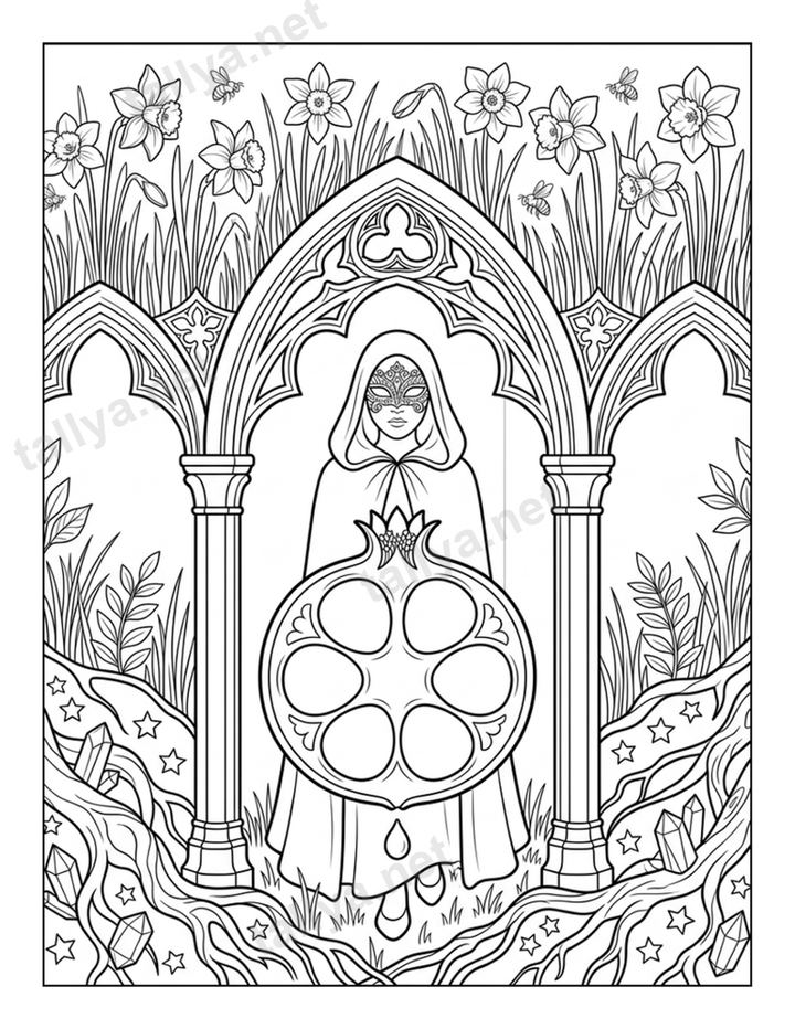
A narrative mandala keeps the circle and symmetry of a traditional mandala but fills them with nameable objects,…